Here is my project where I designed it in Microsoft Word.
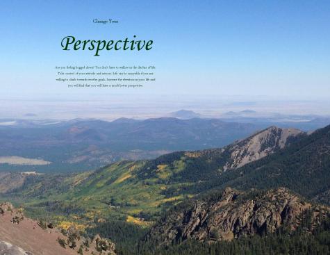
Process: I knew what image I was going to use as soon as I learned about this project. My wife and I hiked Humphrey’s Peak just a couple of weeks ago and this is one of the pictures we took towards the top of the mountain. It is the tallest mountain in Arizona at 12, 600 feet and from the top you can actually see the Grand Canyon (at a different angle not shown in this photo). The reason I chose this photo is because of the contrast in colors from the lava rock to the left to the grey rock formations to the green and yellow forest below. The text I added was an idea I had myself that I included.
Critique Report: My sister helped me to decide the placement of the text in the picture. Together we discovered a spot that provided a good balance with the photo. Then, a classmate helped me to see that I should use a different font color for the text to provide a better contrast.
Links to images: My own personal camera.
Font names:
Title- Monotype Corsiva
Body- Arabic Typesetting


